4.8 Price Density: A Visual Way to Measure Market Choppiness
Box a window of price and see how much the candles fill. A trend leaves it empty; a chop paints it wall to wall. Price density is the efficiency ratio you can read by eye.
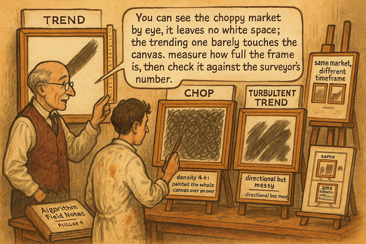
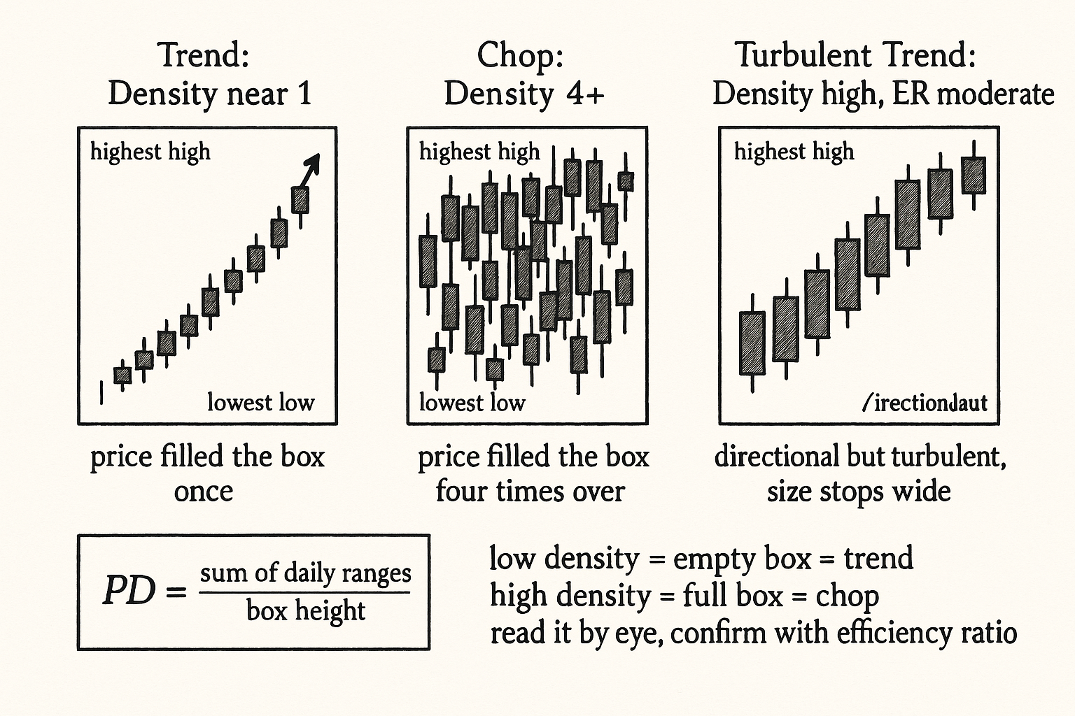
Draw a box around 10 days of price action: the top of the box is the highest high of the 10 days, the bottom is the lowest low. Now ask how much of that box the price actually filled in with its daily ranges. A market that trended cleanly through the 10 days drew one diagonal line corner to corner and left most of the box empty. A market that chopped sideways painted the whole box, its daily ranges stacking on top of each other to fill the space. The fraction of the box that got filled is price density, and a high number means a choppy market while a low number means a directional one. You can almost read it off the chart by eye, which is the point: it is the efficiency ratio's more visual cousin.
The article "Efficiency Ratio Explained for Traders" gave the primary noise measure. This article gives the second measure that "Noise Is Not Volatility" promised as a cross-check, the one you can see rather than only compute. Price density and the efficiency ratio answer the same question (per unit of motion, how much net direction) through different geometry, and when they disagree it tells you something specific about the kind of choppiness present. Using two measures that can disagree is the same discipline as the article "Permutation Tests for Indicator Significance" applied to significance: one estimate can fool you, two estimates that agree are harder to fool.
The formula and the geometry
Price density is the sum of the daily ranges divided by the total range of the window.
$$ \text{PD} = \frac{\displaystyle\sum_{i=1}^{n} (\text{High}_i - \text{Low}_i)}{\max(\text{High}) - \min(\text{Low})} $$
The numerator adds up each bar's individual high-to-low range, the total amount of vertical ground the price covered bar by bar. The denominator is the full height of the box, the highest high minus the lowest low over the whole window. The ratio is how many times over the price covered the box's height. A market that trended straight up covers the box height roughly once, so its density is near 1. A market that chopped up and down covered the box height many times over, so its density is large, 3, 4, 5 or more, depending on how many bars it took and how much each bar overlapped the others.
Note that price density is not bounded between 0 and 1 the way the efficiency ratio is; it runs from roughly 1 (a perfect trend covers the box once) upward with no fixed ceiling (the more bars and the more overlap, the higher it climbs). To compare it across windows of different length you normalize by the number of bars, because a 20-day window mechanically sums more ranges than a 10-day window. The cleaner cross-window form divides the density by the bar count, giving an average overlap per bar that is comparable across window lengths.
The geometric reading is the value. The efficiency ratio asks "how straight was the path from start to end". Price density asks "how much of the available vertical space did the price scribble over". They are two ways of measuring the same scribbling. A clean trend is a straight path (high efficiency ratio) that fills little of the box (low density). A chop is a tangled path (low efficiency ratio) that fills all of the box (high density). The two measures move in opposite directions by construction, which is exactly what makes their agreement a meaningful cross-check.
Why a second measure earns its keep
If price density and the efficiency ratio always agreed perfectly, the second one would be redundant. They mostly agree, and the cases where they diverge are diagnostic, which is the reason to carry both.
Agreement case: clean trend. Low density (price fills little of the box) and high efficiency ratio (straight path). Both say trend. Deploy trend systems. No ambiguity.
Agreement case: pure chop. High density (price fills the whole box) and low efficiency ratio (tangled path). Both say reversion. Deploy fade systems. No ambiguity.
Divergence case: the gap-and-drift. Consider a market that gaps once and then sits quietly: one big jump fills a lot of the box height in a single bar, and the efficiency ratio reads high (the net change is large relative to the small subsequent path), but the density reads low for a different reason (few bars, little overlap). Here both happen to say "trend-ish" but for different reasons, and the low trade frequency warns you the trend is one event, not a sustained move, the gap-distortion failure the efficiency-ratio article flagged. The density confirms the move was a single bar rather than a process.
Divergence case: the volatile grind. Consider a market that trends up but with enormous daily ranges, each bar covering huge ground while still closing higher. The efficiency ratio can read moderate-to-high (net direction survives), but the density reads high (the large overlapping ranges fill the box). This divergence flags a trend that is real but expensive to hold, because the wide bars mean deep adverse excursions inside the trend, the kind of thing the article "MAE/MFE Analysis: Seeing What Net Profit Hides" tells you to size stops around. The density caught the within-trend turbulence the efficiency ratio's endpoint view missed.
The general rule: when the two measures agree, trust the regime call. When they diverge, the divergence names the specific feature (one-event move, or turbulent-but-directional) that a single measure would have hidden. Two cheap measures buy you a third piece of information their disagreement reveals.
Reading density off a chart by eye
Price density's practical advantage is that you can estimate it visually, which the efficiency ratio you cannot. Put a box around the window and look at how much candle-body-and-wick ink fills it.
A box that is mostly white space with a single diagonal smear of candles is low density: a trend. A box that is densely packed with overlapping candles wall to wall is high density: a chop. A box with packed candles at one end and white space at the other is a transition: a range that broke into a trend or a trend that died into a range. This visual read is a fast first-pass regime classifier you can do on any chart without a calculation, and then confirm with the computed efficiency ratio. The article "Why Indicator Histograms Matter" argued for looking at the distribution rather than a single number; price density is the chart-level version of that instinct, looking at how the price distributed itself through the box.
The visual read also makes the timeframe dependence from "How to Choose the Right Timeframe for a Strategy" tangible. Box the same market at the hourly scale and the box is densely packed (high density, choppy); box it at the weekly scale and the box opens up (lower density, more directional). You see the noise-by-timeframe relationship directly as the box filling and emptying as you change the bar size.
Failure modes and how to handle them
Price density has its own ways of misleading, distinct from the efficiency ratio's, which is part of why pairing them helps.
Failure 1: window-length sensitivity. Because the numerator sums more ranges on a longer window, raw density is not comparable across window lengths. Always normalize by bar count before comparing, and never compare a raw 10-day density to a raw 30-day density.
Failure 2: a single wide bar. One enormous range bar inflates both numerator (its own large range) and denominator (it sets the box height), and the net effect on density is ambiguous. As with the efficiency ratio, winsorize or cap extreme single-bar ranges before computing, or read the measure on a window long enough that one bar does not dominate.
Failure 3: trending-with-overlap ambiguity. A market can trend and still have high density if every bar is wide and overlapping, the volatile-grind divergence above. Do not read high density as automatically meaning chop; read it together with the efficiency ratio, and let the divergence tell you it is a turbulent trend rather than a range.
Failure 4: gap markets. Markets that gap (overnight equity, weekend crypto, weekly FX opens) break the bar-to-bar range assumption, because the gap is movement that no single bar's high-low range captures. For gap-prone markets, include the gap in the range (use true range, which counts the gap) so the density reflects the actual ground covered, the same adjustment the article "Why ATR Normalization Is More Than a Volatility Trick" made for true range.
Decision summary
| Density | Efficiency ratio | Regime call | Action |
|---|---|---|---|
| Low (near 1) | High (above 0.30) | Clean trend | Trend systems |
| High (3+) | Low (below 0.20) | Pure chop | Mean-reversion systems |
| Low | High, but few bars moved | One-event move (gap) | Treat as single event, not a trend |
| High | Moderate-to-high | Turbulent but directional | Trend with wide, MAE-sized stops |
The two measures together give a richer regime call than either alone. Agreement confirms the regime; divergence names the specific feature that changes how you trade it.
Visualizing price density
KEY POINTS
- Price density is the sum of the daily ranges divided by the total range of the window: how many times over the price covered the height of its own high-low box.
- A clean trend covers the box height about once (density near 1, empty box). A chop covers it many times over (density 3, 4, 5 or more, full box). It is the efficiency ratio's visual cousin and moves in the opposite direction by construction.
- Price density is not bounded 0 to 1 like the efficiency ratio; it runs from about 1 upward with no ceiling. Normalize by bar count before comparing across window lengths.
- Carrying both measures earns its keep through their disagreements. When they agree, trust the regime call. When they diverge, the divergence names a specific feature one measure alone would hide.
- Divergence case, gap-and-drift: high efficiency ratio but low density and few bars warns the move was one event, not a sustained trend. Divergence case, volatile grind: moderate efficiency ratio but high density flags a real but turbulent trend with deep within-trend excursions.
- The practical advantage is visual: box a window and read how much candle ink fills it. Mostly white with a diagonal smear is a trend; packed wall to wall is a chop. A fast first-pass regime classifier you confirm with the computed efficiency ratio.
- The visual read makes timeframe dependence tangible: the same market's box is packed at the hourly scale and opens up at the weekly scale, showing the noise-by-timeframe relationship directly.
- Failure modes: window-length sensitivity (normalize by bar count), single wide bars (winsorize), trending-with-overlap ambiguity (read alongside the efficiency ratio), and gap markets (use true range so gaps count toward the ground covered).
- The next article, "The Difference Between Volatility Expansion and Directional Opportunity", separates a related confusion: a market filling its box faster (volatility expanding) is not the same as a market offering more net direction.
References
- Trading Systems and Methods - Perry Kaufman (Amazon)
- Cybernetic Trading Strategies - Murray Ruggiero (Amazon)
- The Art of Currency Trading - Brent Donnelly (Amazon)
- Microstructure Evidence from the Polymarket Order Book - arXiv
- Identifying Noise Traders: The Head-And-Shoulders Pattern In U.S.
- Financial Time Series and Their Characteristics
- Trading and Market Microstructure - arXiv
- Decomposing Equity Risk: The Case for Segment-Level Financial
- Reframing Financial Markets as Complex Systems
- Financial Time Series: Stylized Facts for the Mexican Stock ... - arXiv
- Quantitative Finance - arXiv
- Order flow, bid–ask spread and trading density in foreign exchange markets
- The Dynamics of Market Efficiency
- On the Correlation Structure of Microstructure Noise: A Financial Economic Approach
- How Often to Sample a Continuous-Time Process in the Presence of Market Microstructure Noise
- Technical Market Indicators: An Overview
- Stock Pattern Assistant (SPA): A Deterministic and Interpretable Pattern-Recognition Framework for Market Microstructure
- Hedge Funds and Stock Market Efficiency - jstor
A note on AI. The ideas, research, analysis, and conclusions in this article are my own. I use AI tools to help with editing and wordsmithing, because English is not my first language, and I am not shy about that. AI-generated ideas and AI-assisted writing are not the same thing: the first is empty slop from a generic prompt, the second is a tool for communicating years of real research more clearly. Judge the work by its substance, not by whether software helped polish the prose.