6.49 Percentile-Rank Momentum With Hysteresis: Low-Churn Signals
Landolfi's percentile-rank momentum: rank moves against their own sign-consistent past, gate them with a hysteresis band to kill churn, validate with a walk-forward bundle. Steal the plumbing, doubt the crypto curve.
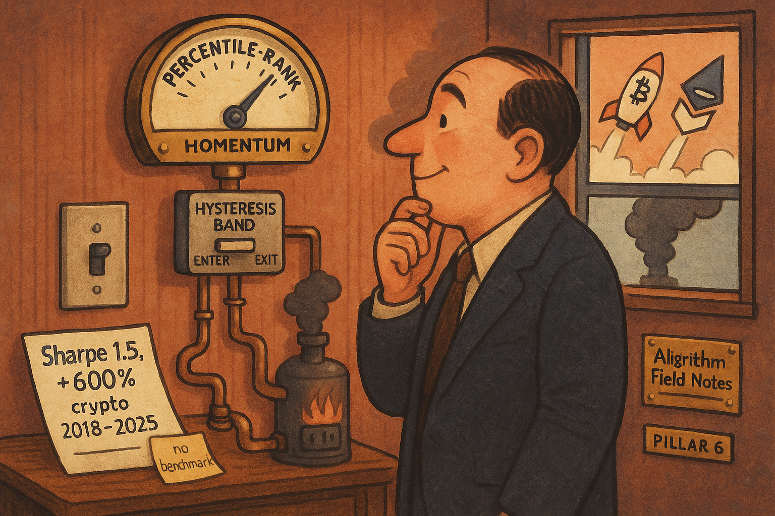
Momentum is the oldest anomaly in the book, and a new momentum paper has to justify why it exists. Landolfi's percentile-rank framework does not sell you the momentum. It sells the plumbing around it: rank each move against its own sign-consistent history instead of a raw threshold, gate entries and exits with a hysteresis band so the signal stops flip-flopping, and validate with a grid of walk-forward splits instead of one arbitrary calibration. The strategy underneath is long/short trend on BTC and ETH. The engineering is the contribution.
Two of the three ideas are worth stealing whatever you think of the evidence, and the evidence deserves suspicion. This is a company whitepaper on crypto, tested across 2018 to 2025, the easiest trending market of the decade, with no benchmark and no reference list. The old article "Ranking Beats Forecasting for Many Trading Problems" argued that you should order things rather than predict their magnitude, because magnitude is where forecasts die. This paper takes that instinct and points it at a single instrument's own past. That move is clever and it is also where the first question mark sits.
Rank the move against its own past, by sign
Start with the raw material. Momentum is measured over several lookback horizons, and each horizon spits out a lagged return. Returns from a calm week and a violent week are not comparable, so the framework divides each by a recent volatility estimate before doing anything else.
$$ \tilde{r}_n[t] = \frac{r_n[t]}{\sigma_{t-1}} $$
The normalized return r-tilde over horizon n is the raw n-bar return divided by yesterday's volatility estimate, sigma at t minus 1, usually an exponentially weighted standard deviation. The point is comparability. A 6% move means something different in a 2% world than in a 5% world.
Work it. A 20-bar return of 6% in a regime where weekly volatility sits at 4% gives a normalized reading of 0.06 divided by 0.04, or 1.5. The same 6% move when volatility has fallen to 2% reads 3.0, twice as extreme. Without the division you would treat two very different events as identical. With it, the signal speaks in standard deviations.
Then the actual novelty. Instead of scoring that normalized move against one fixed cutoff, the framework ranks it as a percentile against its own history, and it splits the history by sign. Up-moves are ranked only against past up-moves; down-moves are ranked only against past down-moves in absolute terms.
$$ \operatorname{rank}^{(+)}_{n}[t] = \frac{\#\{\, r_n[\tau] > 0 \ \text{and}\ r_n[\tau] \le r_n[t] \,\}}{\#\{\, r_n[\tau] > 0 \,\}} \in [0, 1] $$
The long-side rank counts how many past positive n-bar moves were smaller than or equal to today's move, divided by the total count of past positive moves. It answers one question: among all the up-moves this market has ever made, how big is this one. The short side does the same with the magnitude of negative moves against past negative moves.
Work it. Today's 20-bar move is a positive 6%. Look back and find 200 prior positive 20-bar moves, of which 170 were 6% or smaller. The long rank is 170 divided by 200, or 0.85. Today sits in the 85th percentile of this market's up-moves. Rank the same move against all history, up and down mixed, and you dilute it with a crowd of down-moves it has nothing to do with. Splitting by sign keeps a strong rally judged against rallies.
This is where the paper diverges from the old article "Cross-Sectional Percentile Rank Within a Universe." That method ranks one market against its peers at a single moment, a snapshot across instruments. This one ranks one market against its own past, a filmstrip through time. Both output a clean 0-to-1 number, and both dodge the scaling problems of raw indicators, but they answer different questions. Peer ranking asks who is strongest now. Self ranking asks whether this is a big move for me. Self ranking carries a hidden cost the cross-sectional version avoids: your reference distribution is one asset's history, so a structural shift in that asset quietly poisons every rank that follows.
The composite score
Each horizon produces its own rank. The framework blends them into one number per side with a convex weighting, weights that are non-negative and sum to one.
$$ S_{\text{long}}[t] = \sum_i w_i \operatorname{rank}^{(+)}_{n_i}[t], \qquad w_i \ge 0, \ \sum_i w_i = 1 $$
The long score S-long is a weighted average of the long-side ranks across horizons. Because the weights sum to one and each rank lives in 0 to 1, the composite stays in 0 to 1 too. The paper's heuristic is to weight shorter horizons more for responsiveness and taper the weight as horizons lengthen, so a fast move can move the score while the slow horizons anchor it.
Work it. Use two horizons, a short one weighted 0.6 and a long one weighted 0.4. If the short-horizon long rank is 0.85 and the long-horizon long rank is 0.70, the composite is 0.6 times 0.85 plus 0.4 times 0.70, which is 0.51 plus 0.28, or 0.79. One number, bounded, that you can hang a decision rule on.
Hysteresis is the actual product
The title of this piece is the part that earns its keep. A single threshold trades badly. Put an entry cutoff at 0.85 and the moment the score wobbles between 0.84 and 0.86 you sell, buy, sell, buy, paying the spread every time. The fix is two thresholds with a gap between them.
$$ 0 < q_x < q_e < 1 $$
You enter when the composite score rises above the high entry quantile q-e, and you do not exit until it falls below the lower exit quantile q-x, or a maximum holding time forces you out. The gap between q-x and q-e is the hysteresis. The score has to fall a long way, not wobble a little, before the position closes. Engineers call this a Schmitt trigger; it is the same reason a thermostat does not switch the furnace on and off every thirty seconds.
Work it. Set entry at 0.85 and exit at 0.55. The score climbs to 0.87 and you go long. It then drifts down through 0.80, 0.72, 0.60, and you hold through all of it because none breached 0.55. Only when it finally hits 0.50 do you exit. A single 0.85 line would have thrown you out at 0.80 and back in at any bounce, several round-trips over the same path. The band traded twice.
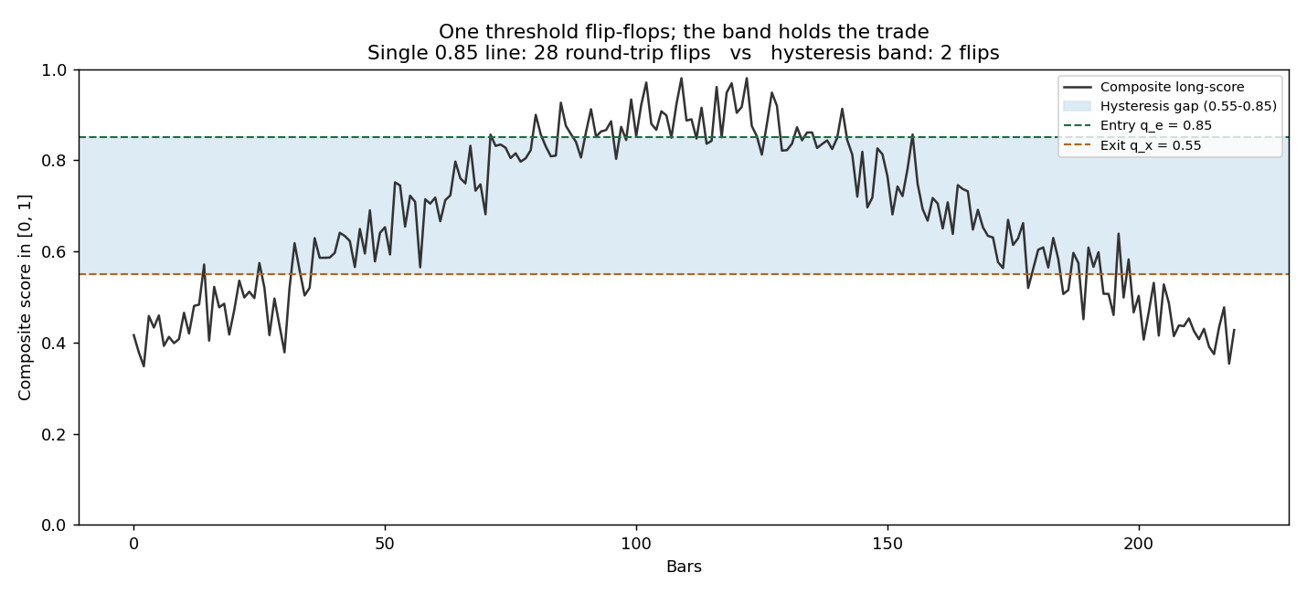
The chart is the whole argument for why this survives costs. Over one simulated hump the naive threshold flips 28 times, and each flip is a round-trip spread. The band flips twice. The paper's own defense of its results leans entirely on this: average trade size lands in the 30 to 40 basis point range, so even a fat cost model does not erase the profit. That claim only holds because the hysteresis keeps trades few and large. Strip the band out, keep everything else, and the same signal would churn its edge into the spread. Low churn is not a nice property here. It is the load-bearing wall.
The walk-forward bundle
The last idea attacks a quieter problem: how you validate. Classic walk-forward analysis picks one in-sample length and one out-of-sample step, re-fits on each in-sample window, and tests on the next out-of-sample block. The catch is that both numbers are arbitrary. A 12-month window with monthly re-calibration and a 60-month window with semiannual re-calibration can tell opposite stories on the same data.
The bundle runs the whole grid instead of picking one. In-sample lengths from 12 to 60 months, out-of-sample steps of 1, 3, and 6 months, both anchored and rolling schemes, first out-of-sample block starting January 2019. Every out-of-sample segment from every configuration gets pooled into one distribution of equity curves. A tight cluster of curves says the result does not depend on the split you happened to choose; a fan of diverging curves says it does.
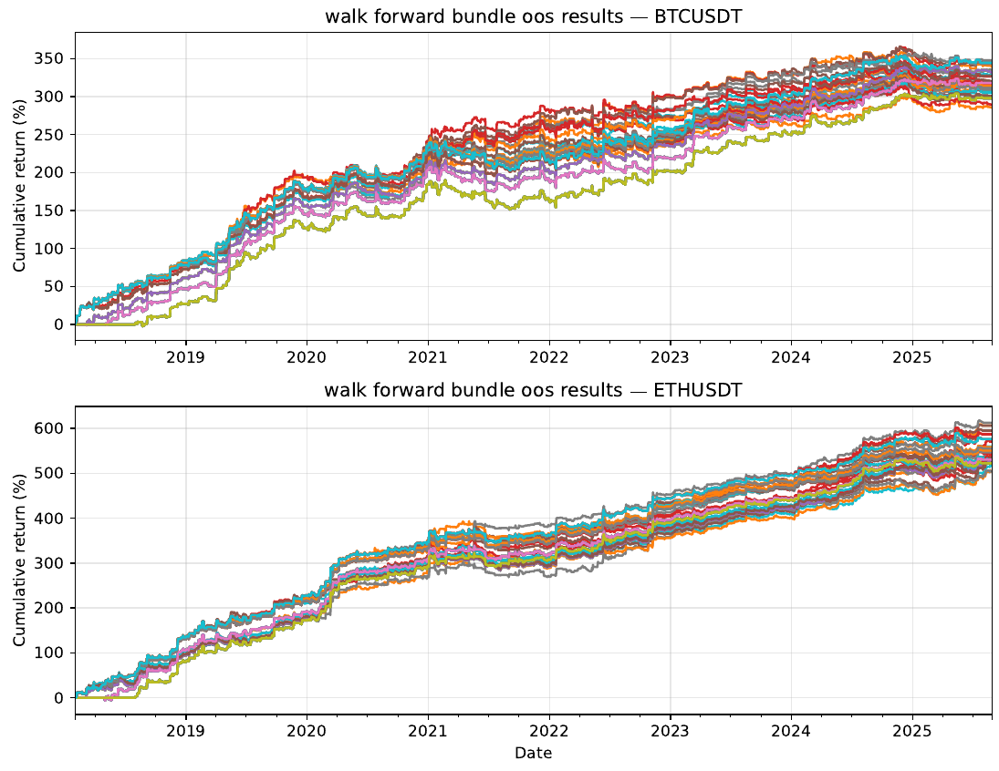
The bundles are tight. BTC lands around 290 to 350 percent cumulative across the grid, ETH around 500 to 620 percent, and the spread between the most and least aggressive calibration schedules is narrow. The cross-sectional Sharpe distribution centers well above one, roughly 1.4 to 1.8 depending on the asset. Read at face value, that is a strategy whose performance does not hinge on a lucky calibration choice.
Read skeptically, the bundle proves less than it looks. It shows insensitivity to the split schedule, not to the market. Every one of those curves rides the same single history: the same 2020-2021 crypto boom, the same 2022 drawdown, the same recovery. This is the exact trap the old article "Collinearity in Parameter Sweeps: Plateaus, Not Peaks" named. A sweep can hold up beautifully while testing one line through the space and proving nothing, because the flat result is the parameters moving together, not the strategy surviving genuinely new conditions. A compact walk-forward bundle on one asset's one timeline is a more honest robustness check than a single split, and it is still one timeline wearing a robustness costume.
What the evidence doesn't show
The framework ships without the numbers that would let you trust it. There is no benchmark. BTC ran from a few thousand dollars to six figures over the test window, so buy-and-hold returned thousands of percent, and a long/short program that made 300 percent might have trailed the asset it trades by a wide margin. The paper never puts the two side by side, and for a market-neutral book that comparison is the first thing an allocator asks. There is no drawdown series, no realized turnover count, no cost model actually applied, only the assertion that 30 to 40 basis point trades make costs a rounding error. It is a whitepaper with no reference list and no peer review, on the single most trend-friendly asset class of the era.
Keep what transfers and drop the marketing. The sign-asymmetric percentile rank is a clean way to make a raw move comparable to its own kind. The hysteresis band is a genuine turnover weapon that belongs on any threshold system you run. The walk-forward bundle is a better habit than the single split everyone defaults to. None of that depends on believing the crypto equity curves. The ideas are portable; the backtest is one asset class in one bull market, and you should treat the Sharpe of 1.5 as a hypothesis, not a result.
KEY POINTS
- The contribution is the machinery around momentum, not the momentum: sign-asymmetric percentile ranking, a hysteresis entry/exit band, and a walk-forward bundle for validation.
- Normalize each lookback return by recent volatility before ranking, so a move is read in standard deviations and stays comparable across calm and violent regimes.
- Rank up-moves only against past up-moves and down-moves only against past down-moves. This keeps a rally judged against rallies, but ties every rank to one asset's own history, which a structural shift quietly corrupts.
- Blend horizon ranks with convex weights that sum to one, weighting short horizons more for responsiveness. The composite stays bounded in 0 to 1.
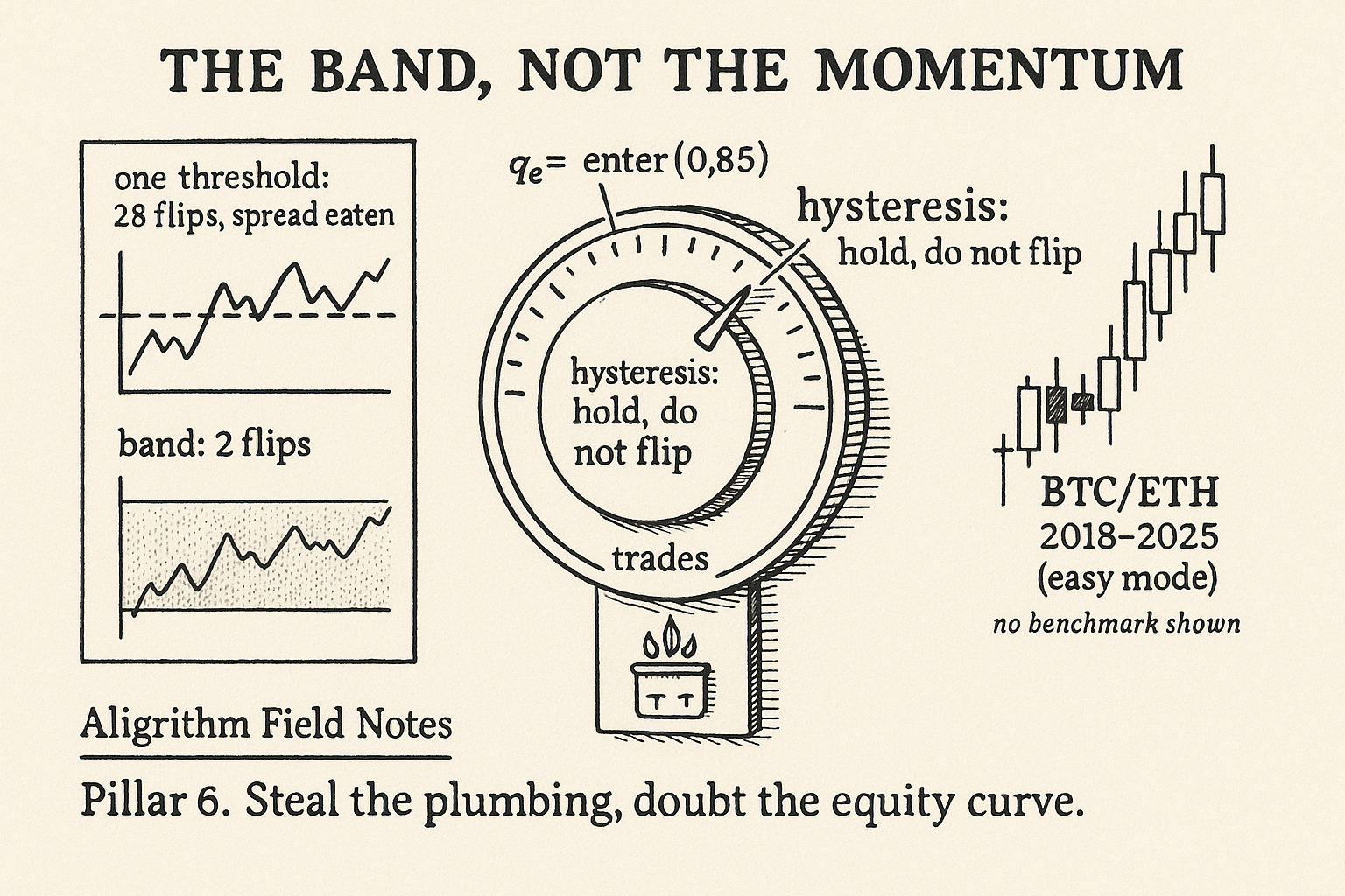
- The hysteresis band is the load-bearing idea. Enter above a high quantile, exit only below a lower one or at a hold cap. In a simple simulation a single threshold flipped 28 times where the band flipped twice. The 30-to-40 basis point average trade only survives costs because churn stays low.
- The walk-forward bundle pools out-of-sample results across a grid of in-sample lengths, steps, and anchoring schemes, replacing one arbitrary split with a distribution. Tight bundles mean insensitivity to the split, not to the market.
- Treat the crypto results with suspicion: no benchmark against a market that rose thousands of percent, no drawdown or turnover disclosed, costs asserted not applied, a whitepaper with no references on the decade's most trend-friendly assets. Keep the ranking and the band; doubt the Sharpe of 1.5.
A note on AI. The ideas, research, analysis, and conclusions in this article are my own. I use AI tools to help with editing and wordsmithing, because English is not my first language, and I am not shy about that. AI-generated ideas and AI-assisted writing are not the same thing: the first is empty slop from a generic prompt, the second is a tool for communicating years of real research more clearly. Judge the work by its substance, not by whether software helped polish the prose.