3.4 How to Detect When a Trading System Is Dying
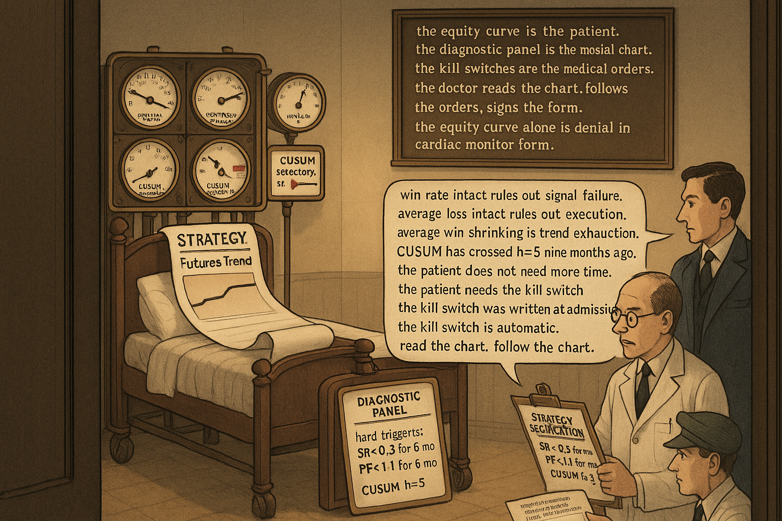
A trading system never dies without warning. Eight diagnostic metrics flash months before the equity curve. Read the metrics. Hard kill switches written at deployment, automatic at threshold.
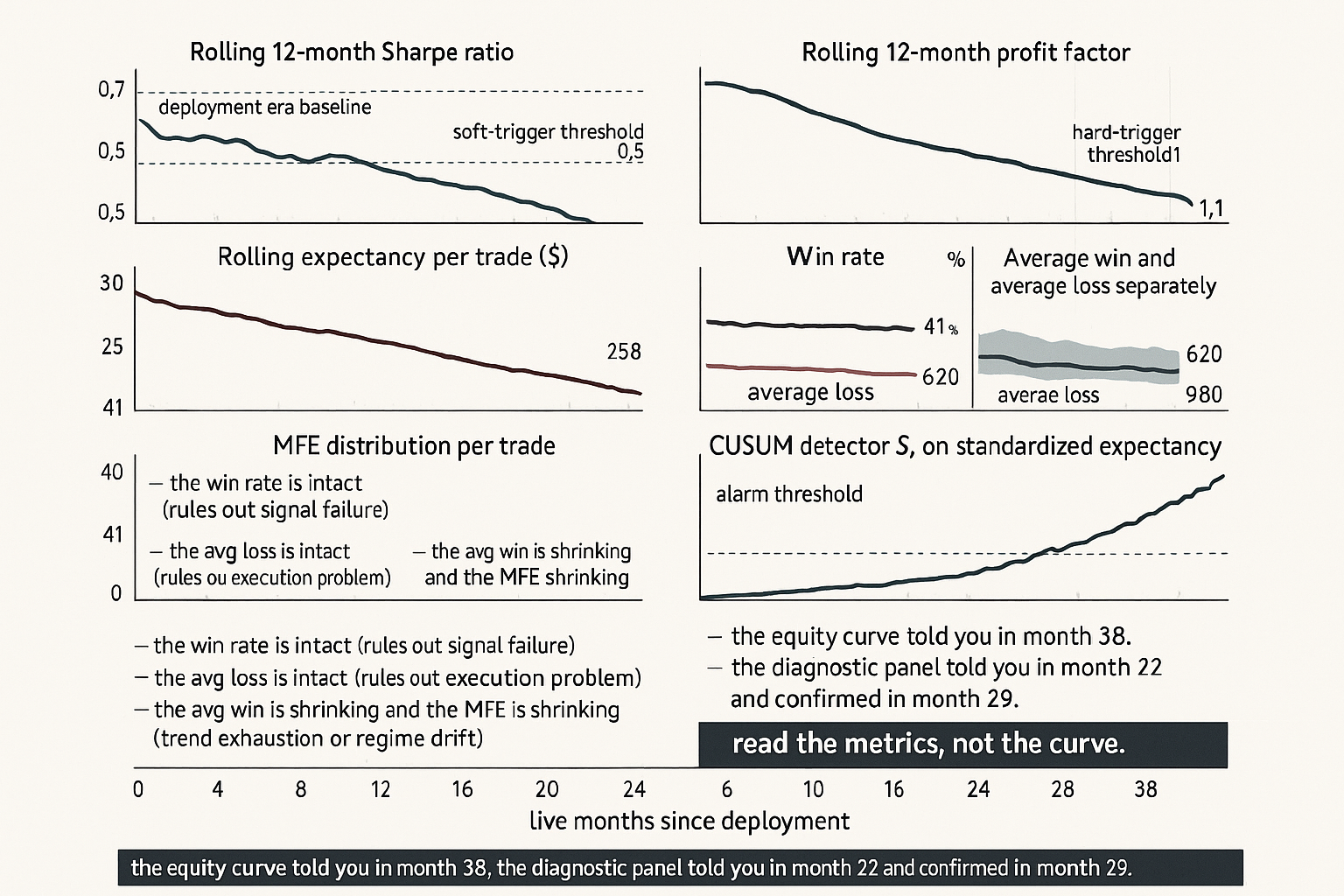
A futures trend system has been live for 38 months on a portfolio of 12 liquid contracts. The original walk-forward backtest (built on 2008 to 2019 data) projected an annualized Sharpe of 0.85, expectancy of $312 per round-trip lot, win rate of 41%, average win of $1,420, average loss of $620, profit factor of 1.75, and time-in-market of 64%. Live results across the 38 months: Sharpe 0.71 in months 1 to 18, Sharpe 0.43 in months 19 to 30, Sharpe 0.18 in the most recent 8 months. Profit factor has fallen from 1.81 to 1.62 to 1.21. Expectancy has dropped from $295 to $190 to $58. Win rate is unchanged at 40 to 42% across the three sub-periods. Average win has shrunk from $1,440 to $1,280 to $980. Average loss is unchanged at $610 to $640.
The system is not breaking randomly. It is dying in a specific, diagnostic way. The win rate is intact, which rules out signal failure. The average loss is intact, which rules out a stop-loss problem or a slippage explosion. The average win is shrinking, which is the signature of trend exhaustion: the trades still trigger correctly and run in the right direction, but the moves are smaller than they used to be. The profit factor and expectancy compression are the downstream consequences of the smaller wins. The article "Why Systems Work Until They Don't" framed this as one of four decay mechanisms (regime drift in the substrate). This article gives the operational diagnostic that distinguishes the four mechanisms in real time, so the trader can act on the right defense rather than the wrong one.
A trading system never dies suddenly without warning. It produces several months of measurable signal degradation before the realized P&L collapses. The trader who is monitoring the right metrics catches the decay early and either retrains, halves allocation, or decommissions cleanly. The trader who is watching only the equity curve catches the decay only after the equity curve has already paid for it. The difference is operationally large: most decommission decisions made on equity-curve signals alone are 6 to 18 months too late.
The diagnostic panel
Eight metrics, monitored on rolling windows, with the deployment-era baseline as the reference. Each metric isolates a different aspect of system health.
Metric 1: rolling Sharpe ratio. The headline metric and the noisiest. A 12-month rolling Sharpe varies by approximately 0.3 to 0.5 standard deviations even for a stationary strategy with true Sharpe of 0.8. Use it as a coarse alarm but do not act on it alone.
Metric 2: rolling profit factor. Total gross profit divided by total gross loss across the rolling window. More stable than Sharpe because it does not depend on the timing of the gains and losses. A profit factor falling from 1.8 to 1.3 over 12 months is a stronger decay signal than the same change in Sharpe.
Metric 3: rolling expectancy per trade. The average P&L per round-trip in dollars or in R-multiples (the ratio of trade P&L to the trade's initial risk). Expectancy decay is the cleanest indicator that the underlying edge is shrinking, because it strips out trade frequency and position sizing.
Metric 4: win rate. The fraction of trades that close profitable. A stable win rate during expectancy decay is the trend-exhaustion signature. A falling win rate during expectancy decay points to signal failure.
Metric 5: average win and average loss separately. Tracking the two together is cheap and informative. Average loss is roughly bounded by the system's stop-loss rule and should be stable; if it grows, the strategy is missing stops or paying execution slippage. Average win has no upper bound and decays first when the substrate compresses (lower volatility, smaller trends, faster mean reversion).
Metric 6: maximum adverse excursion (MAE) per trade. The deepest drawdown the trade experienced before it closed. A growing MAE distribution means trades are sitting at deeper losses before resolving, which signals lower conviction in the entry signal or unstable entry timing. The article "MAE/MFE Analysis: Seeing What Net Profit Hides" later in this pillar covers the tool in detail.
Metric 7: maximum favorable excursion (MFE) per trade. The largest open profit the trade reached before it closed. A shrinking MFE distribution at constant win rate is the canonical trend-exhaustion signature: the strategy still catches the right direction but the move is shorter.
Metric 8: time-in-market and trade frequency. A strategy that suddenly trades less (or more) than its historical baseline is interacting with the market differently. Often this signals that the entry filters are firing under different conditions, which is itself a regime-change diagnostic.
Calibrating the alarm thresholds
A drop in any single metric can be statistical noise. The key question: how large a drop, sustained over how many months, exceeds what stationary noise should produce?
For a strategy with true Sharpe of 0.8 and 12 trades per month, the 12-month rolling Sharpe has a standard deviation of approximately 0.4 under stationarity. A one-month dip below 0.4 is unremarkable. A 12-month sustained Sharpe below 0.4 is a 1-sigma event under the null and a strong signal under the regime-change alternative.
$$ \sigma_{\hat{\text{SR}}} \approx \sqrt{\frac{1 + \text{SR}^2 / 2}{n}}, \qquad n = \text{number of independent observations in the window} $$
The formula gives the asymptotic standard error of an estimated Sharpe ratio under the assumption of independent returns. For a daily-return strategy with n = 252 (one year), SR = 0.8, the standard error is approximately 0.07 in annualized units. For a monthly-return aggregation with n = 12 (one year), the standard error is approximately 0.31. The right threshold for "this is decay, not noise" depends on the window and the underlying volatility of the metric.
The complementary tool is the Monte Carlo bootstrap: resample the strategy's historical trade-by-trade P&L distribution, build a 12-month rolling-Sharpe distribution under the null of stationarity, and place the realized rolling Sharpe in that distribution. Persistent residence in the bottom 10% of the bootstrap distribution is decay; a single dip is noise. The article "Monte Carlo for Trading Systems" later in this pillar gives the bootstrap mechanics.
Distinguishing the four decay mechanisms
The mechanisms (alpha crowding, regime drift, microstructure change, capacity saturation) leave different fingerprints on the diagnostic panel.
Alpha crowding fingerprint: average win shrinks (less profit per trade because faster arbitrage), transaction costs rise (slippage on entry/exit grows with crowd size), win rate roughly stable. The strategy still finds the same setups but the post-cost edge is compressing.
Regime drift fingerprint: average win shrinks (smaller moves in the new regime), MFE distribution shifts down, transaction costs stable, win rate may be stable or falling depending on whether the entry filter still selects valid setups in the new regime. The substrate is doing different things, the strategy is doing the same thing.
Microstructure change fingerprint: a step-change in execution metrics. Effective spread doubles, slippage per trade jumps, fill rates drop, average loss grows because the strategy is paying more on each round-trip. The change is dated; the diagnostic is the date alignment with the venue change.
Capacity saturation fingerprint: the headline strategy P&L diverges from a small-size shadow book of the same strategy. The shadow shows expected performance, the live large book shows compressed performance. The compression scales with the live position size relative to available liquidity.
The four fingerprints do not always present cleanly. A real failure is often a combination. The decision matrix in the prior article gives the rough mapping; the diagnostic panel here gives the inputs to the decision.
The kill switches
Four decommission triggers, each tied to a specific metric and threshold. The triggers are written into the strategy specification at deployment and are not negotiable in the moment.
$$ \begin{array}{l|l} \text{Trigger} & \text{Threshold} \\ \hline \text{Drawdown trigger} & \text{Realized DD} > 1.5 \times \text{historical max DD} \\ \text{Sharpe trigger} & \text{12-month rolling SR} < 0.3 \text{ for 6 consecutive months} \\ \text{Profit-factor trigger} & \text{12-month rolling PF} < 1.1 \text{ for 6 consecutive months} \\ \text{CUSUM trigger} & \text{CUSUM on standardized expectancy crosses } h = 5 \\ \end{array} $$
The thresholds are illustrative. Each strategy needs calibration against its own deployment-era baseline and Monte Carlo distribution. The principle: the trigger is automatic, written down before the strategy is funded, and triggered without discretionary override. The article "Why Systems Work Until They Don't" framed the discretionary-override pitfall; the present article gives the procedural defense.
A complementary set of soft triggers reduces allocation rather than decommissioning outright. Halve allocation if the rolling Sharpe falls below 0.5 for 3 months. Halve again if it stays there for 6 months. Decommission at the hard threshold. Tapering by allocation is operationally useful because it lets the strategy continue to provide diagnostic data while reducing the cost of waiting for the hard trigger.
Distinguishing decay from drawdown
A normal drawdown on a healthy strategy looks identical to early decay if you only look at the equity curve. The discrimination requires the diagnostic panel.
Healthy drawdown signatures: win rate within historical band, average win within historical band, average loss within historical band, profit factor temporarily depressed by a streak of losers, recovery to baseline within the historical recovery time. The Monte Carlo bootstrap places the drawdown well within the stationary distribution.
Decay signatures: at least one of (win rate falling, average win shrinking, profit factor compressing) sustained across multiple months, the drawdown exceeds the bootstrap distribution's 90th percentile, the recovery time is longer than the historical maximum, the diagnostic CUSUM has crossed its threshold.
The discrimination is not always clean in real time. The first 3 months of a true decay look identical to a normal drawdown. The diagnostic value comes from waiting for the multi-month signature to confirm before acting, while not waiting so long that the cost of acting is high. The trade-off was discussed in detail in "Slow Wandering: The Most Dangerous Type of Market Change".
Operational cadence
A monthly review process makes the diagnostic panel actionable. The minimum cadence:
Weekly: review the live P&L, check for any single-day or single-week anomaly that exceeds the 99th percentile of the historical distribution. Verify execution quality (effective spread, fill rate, markout) is within the historical band.
Monthly: refresh the rolling-window metrics, compare each to the bootstrap-implied confidence band, log any metric that has crossed below its band. Check the CUSUM detectors. Update the soft-trigger allocation if any threshold has been breached.
Quarterly: full diagnostic panel review. Stratify the realized performance by regime (volatility regime, market mode). Compare to the regime-stratified bootstrap distribution. Decide on retraining if the diagnostics indicate slow drift, on decommissioning if the diagnostics indicate structural break.
Annually: re-derive the bootstrap distribution from the longest available trade history. Re-calibrate the alarm thresholds against the updated bootstrap. Audit the post-mortem log of any decommissioned strategies for prior-update lessons.
Decision matrix
| Diagnostic finding | Most likely state | Action |
|---|---|---|
| All metrics within bootstrap band | Healthy, normal drawdown if any | Continue, monitor |
| Sharpe below band, others within band | Statistical noise on Sharpe | Continue, increase monitoring frequency |
| Avg win shrinking, win rate stable | Trend-exhaustion or regime drift | Quarterly retrain, monitor regime indicators |
| Avg win shrinking, costs rising | Alpha crowding | Reduce allocation, monitor capacity |
| Avg loss growing, win rate stable | Execution problem or microstructure | Audit execution, check venue changelog |
| Win rate falling, avg win stable | Signal failure | Decommission, post-mortem signal definition |
| Live P&L diverges from shadow book | Capacity saturation | Reduce allocation to shadow level |
| CUSUM trigger fires on expectancy | Confirmed decay | Decommission per policy, post-mortem |
| Drawdown exceeds Monte Carlo 99th pct | Real failure regardless of mechanism | Decommission per policy |
The matrix is operational, not exhaustive. It maps the diagnostic outputs to the action plan, with the article "Why Systems Work Until They Don't" providing the strategic frame and the present article providing the procedural manual.
Anti-patterns
Five mistakes that show up around system-death detection.
Anti-pattern 1: equity curve as the only monitor. The equity curve aggregates every metric into one signal that is too noisy and too lagged. By the time the equity curve makes the decay obvious, the diagnostic panel has been flashing for months. Read the metrics, not the curve.
Anti-pattern 2: monthly P&L as the test. A single month is too short. A single year is borderline. The monthly P&L of a strategy with true Sharpe 0.8 has a standard deviation of approximately 6% on a 1-vol-target portfolio. A 6% loss month is one standard deviation, which is unremarkable. Decisions should be made on the rolling windows and the bootstrap-calibrated thresholds, not on individual months.
Anti-pattern 3: discretionary override of the hard trigger. The trigger fires. The trader looks at the realized P&L, decides "this strategy will recover", and continues funding it. Six months later the strategy has lost more capital than the prior year of P&L. The cure: the trigger is automatic. If the trader wants to override, the override requires written justification and external sign-off. The friction of the process is the defense.
Anti-pattern 4: re-tuning the alarm threshold to suppress an alarm. The strategy's CUSUM crosses h=5. The trader raises the threshold to h=8 and observes that the alarm no longer fires. The alarm has been muted but the underlying decay is the same. The cure: thresholds are set at deployment time and changed only with the same rigor as the original calibration.
Anti-pattern 5: monitoring everything but acting on nothing. The trader builds an elaborate monitoring dashboard, watches it daily, and never decommissions a strategy. The dashboard is a comfort blanket, not a decision tool. The cure: every metric on the dashboard has a written threshold and a written action. If the threshold has been crossed and the action has not been taken, the dashboard has failed.
Visualizing the diagnostic panel
KEY POINTS
- A trading system never dies suddenly without warning. It produces several months of measurable signal degradation before the realized P&L collapses. The trader who monitors the right metrics catches the decay early; the trader who watches only the equity curve catches it 6 to 18 months late.
- The diagnostic panel is eight metrics: rolling Sharpe, rolling profit factor, rolling expectancy, win rate, average win and average loss separately, MAE distribution, MFE distribution, time-in-market and trade frequency.
- Each metric isolates a different aspect of strategy health. Win rate isolates signal validity. Average loss isolates execution and stops. Average win and MFE isolate the substrate's trend-exhaustion or compression. Time-in-market isolates entry-filter regime sensitivity.
- The four decay mechanisms (alpha crowding, regime drift, microstructure change, capacity saturation) leave distinct fingerprints on the panel. Crowding compresses average win and raises costs. Regime drift compresses average win at stable costs. Microstructure change steps the average loss up and execution metrics down. Capacity saturation diverges the live book from the shadow book.
- Alarm thresholds are calibrated against the bootstrap distribution of the diagnostic metrics under the null of stationarity. Persistent residence below the bootstrap 10th percentile is decay; a single dip is noise.
- Hard kill switches are written at deployment, not at decommission: drawdown trigger at 1.5x historical max, Sharpe trigger at 0.3 for 6 consecutive months, profit-factor trigger at 1.1 for 6 consecutive months, CUSUM trigger at h=5 on standardized expectancy.
- Soft triggers taper allocation rather than decommission outright. Halve allocation at the soft Sharpe threshold; halve again on persistence; decommission at the hard threshold.
- Distinguishing decay from drawdown requires the diagnostic panel plus the bootstrap distribution. A normal drawdown looks identical to early decay on the equity curve alone.
- Operational cadence: weekly P&L and execution audit, monthly diagnostic panel review, quarterly regime-stratified analysis with retraining decision, annual bootstrap recalibration.
- Anti-pattern: the equity curve as the only monitor. Anti-pattern: discretionary override of hard triggers. Anti-pattern: re-tuning the alarm threshold to suppress alarms. Anti-pattern: monitoring everything and acting on nothing.
- The current article is the procedural manual that the prior strategic framework ("Why Systems Work Until They Don't") implies. The next article in the publication ("Why OOS Failure Is Often a Stationarity Failure") covers the upstream question: why does the OOS performance differ from in-sample, and how often is the answer not overfitting but a regime change between IS and OOS windows.
References
- Testing and Tuning Market Trading Systems - Timothy Masters (Amazon)
- Data Mining Algorithms in C++ - Timothy Masters (Amazon)
- The Sharpe Stability Ratio: Temporal Consistency of Risk-Adjusted Performance
- A Novel Approach to Trading Strategy Parameter Optimization Using Walk-Forward Analysis and Robust Sharpe Ratio Heatmaps
- The Volatility Premium of Machine Learning
- A Market-State Momentum Signal that Reverses Roles for Robust Performance Across Regimes
- Boosting Models for Nonlinear Alpha in Indian Equity Markets
- 1 Introduction - arXiv
- FactorEngine: A Program-level Knowledge-Infused Factor Mining
- Performance and Risk of an AI-Driven Trading Framework - arXiv
- Backtest Overfitting in the Machine Learning Era: A Comparison of Out-of-Sample Validation Techniques in Finance
- Backtest Overfitting in the Machine Learning Era
- A Practical Approach to Address Backtest Overfitting for Cryptocurrency Trading Using Deep Reinforcement Learning
- A Rigorous Walk-Forward Validation Framework for Market Algorithmic Trading
- The GT-Score: A Robust Objective Function for Reducing Overfitting in Financial Backtests
- AlgoXpert Alpha Research Framework: A Rigorous IS–WFA–OOS Protocol for Detecting Overfitting and Performance Decay in Algorithmic FX Trading
- From Semi-Infinite Constraints to Structured Robust Policies ... - arXiv
A note on AI. The ideas, research, analysis, and conclusions in this article are my own. I use AI tools to help with editing and wordsmithing, because English is not my first language, and I am not shy about that. AI-generated ideas and AI-assisted writing are not the same thing: the first is empty slop from a generic prompt, the second is a tool for communicating years of real research more clearly. Judge the work by its substance, not by whether software helped polish the prose.